And here I am, going back to my figure of the Berceuse for the 5th time. And when you see it you’ll agree with me that it’s nothing but a chromolithograph from a penny bazaar, and what’s more, it doesn’t even have the merit of being photographically correct in the proportions or in anything. But anyway, I’m trying to make an image such as a sailor who couldn’t paint would imagine it when he was in the middle of the sea and thought of a woman on land.
Tag: Color
Filtering: Tagged with color
ResetRain and wind these past few days, I’ve worked at home on the study of which I’ve made a croquis in Bernard’s letter. My aim was to give it colors like stained glass, and a design of solid outlines.
I don’t know if you’ll understand that one can speak poetry just by arranging colors well, just as one can say comforting things in music. In the same way the bizarre lines, sought out and multiplied, and snaking all over the painting, aren’t intended to render the garden in its vulgar resemblance but draw it for us as if seen in a dream, in character and yet at the same time stranger than the reality.
I’ve tried to express the terrible human passions with the red and the green.
Because instead of trying to render exactly what I have before my eyes, I use color more arbitrarily in order to express myself forcefully. Well, let’s let that lie as far as theory goes, but I’m going to give you an example of what I mean. I’d like to do the portrait of an artist friend who dreams great dreams, who works as the nightingale sings, because that’s his nature. This man will be blond. I’d like to put in the painting my appreciation, my love that I have for him. I’ll paint him, then, just as he is, as faithfully as I can — to begin with. But the painting isn’t finished like that. To finish it, I’m now going to be an arbitrary colorist. I exaggerate the blond of the hair, I come to orange tones, chromes, pale lemon. Behind the head — instead of painting the dull wall of the mean room, I paint the infinite. I make a simple background of the richest, most intense blue that I can prepare, and with this simple combination, the brightly lit blond head, against this rich blue background achieves a mysterious effect, like a star in the deep azure.
I’m beginning to see the advantages here. For myself, I’m in better health here than in the north — I even work in the wheatfields at midday, in the full heat of the sun, without any shade whatever, and there you are, I revel in it like a cicada. My God, if only I’d known this country at 25, instead of coming here at 35 — in those days I was enthusiastic about grey, or rather, absence of colour. I was always dreaming about Millet, and then I had acquaintances in Holland in the category of painters like Mauve, Israëls.
Now that I’ve seen the sea here I really feel the importance there is in staying in the south and feeling — if the color has to be even more exaggerated — Africa not far away from one.
Many of the subjects here are just — in character — the same as in Holland — the difference is in the colour. There’s sulphur everywhere where the sun beats down.
It seems to me that the more finely a color is ground, the more it is saturated by oil. Now we’re not over-fond of oil, that goes without saying. If we painted like Monsieur Gérôme and the other trompe-l’oeil photographic ones, we’d no doubt ask for colors ground very fine. We, on the contrary, don’t strongly object to the canvas having a rough look. So if instead of having the color ground on the stone for God knows how many hours, we grind it just long enough to make it workable, without bothering too much about the fineness of the grain, we’d have colors that were fresher, perhaps darkening less
| Artist | Eugène Delacroix |
|---|---|
| Year | ca. 1853 |
| Medium | Oil on canvas |
| Dimensions | 50.8 cm × 61 cm (20 in × 21 in) |
| Location | The Met, New York City |
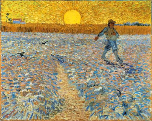
Yesterday and today I worked on the sower, which has been completely reworked. The sky is yellow and green, the earth purple and orange. There’s definitely a painting like that to be made of this splendid subject, and I hope it will be done one day, either by someone else or by me. The question remains this—Christ’s boat by Eugène Delacroix and Millet’s sower are of entirely different workmanship. Christ’s boat—I’m talking about the blue and green sketch with touches of purple and red and a little lemon yellow for the halo, the aureole—speaks a symbolic language through color itself. Millet’s sower is colorless grey—as are Israëls’s paintings too. Can we now paint the sower with color, with simultaneous contrast between yellow and purple for example (like Delacroix’s Apollo ceiling, which is precisely yellow and purple), yes or no? Yes—definitely. So do it then!
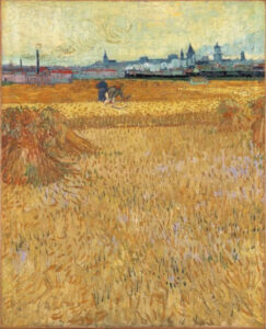
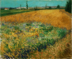
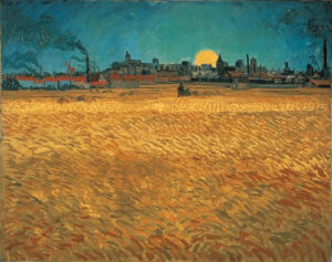
I’ve had a week of concentrated hard work in the wheatfields right out in the sun, the result was some studies of wheatfields, landscapes and a sketch of a sower. In a ploughed field, a large field of clods of purple earth rising towards the horizon a sower in blue and white. On the horizon a field of short, ripe wheat. Above all that a yellow sky with a yellow sun. You can sense from the mere nomenclature of the tonalities that color plays a very important role in this composition.
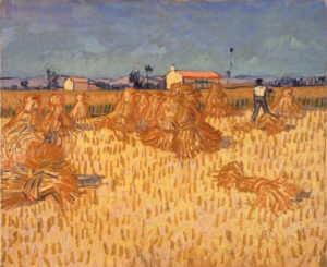
More and more it seems to me that the paintings that ought to be made, the paintings that are necessary, indispensable for painting today to be fully itself and to rise to a level equivalent to the serene peaks achieved by the Greek sculptors, the German musicians, the French writers of novels, exceed the power of an isolated individual, and will therefore probably be created by groups of men combining to carry out a shared idea. One has a superb orchestration of colours and lacks ideas. The other overflows with new, harrowing or charming conceptions, but is unable to express them in a way that’s sufficiently sonorous, given the timidity of a limited palette. Very good reason to regret the lack of an esprit de corps among artists, who criticize each other, persecute each other, while fortunately not succeeding in cancelling each other out.
Tomorrow I’m going to Saintes-Maries-de-la-Mer just to see a blue sea and a blue sky. And just to get an idea of the figures. Because I think that I’ll suddenly make a furious attack on the figure, around which I’m currently circling as if I didn’t care about it, but all the same that’s actually exactly my goal.
I’m beginning to get quite tanned. The people here are tanned by the sun, yellow and orange in colour, and sometimes red ochre.
Perhaps in the Berceuse there’s an attempt at a little music of color from here, it’s badly painted, and chromos bought at the penny bazaar are infinitely better painted technically, but all the same.

